Update: Cook’s distance lines on last plot, and cleaned up the code a bit!
Recently, as a part of my Summer of Data Science 2017 challenge, I took up the task of reading Introduction to Statistical Learning cover-to-cover, including all labs and exercises, and converting the R labs and exercises into Python. While I’m still at early chapters, I’ve learned a lot already. Some commands can be straightforward replicated in Python, some are surprisingly hard to find equivalents without using custom functions etc. (not that it’s needed to have “exact” equivalents, as python also has powerful features unique to it, but I’m thinking this as more of a learning opportunity).
One of the simplest R commands that doesn’t have a direct equivalent in Python is plot() for linear regression models (wraps plot.lm() when fed linear models). While python has a vast array of plotting libraries, the more hands-on approach of it necessitates some intervention to replicate R’s plot(), which creates a group of diagnostic plots (residual, qq, scale-location, leverage) to assess model performance when applied to a fitted linear regression model.
Let’s see the example in R with the Auto dataset:
model = lm(mpg ~ . - name, data=Auto)

par(mfrow=c(2,2)) # Plot 4 plots in same screen
plot(model)
The interpretation of these plots are a subject on its own, which I won’t delve into here. You can find several resources, if you want. For now, I’ll dive into the Python code.
Let’s start with the necessary imports and setup commands:
%matplotlib inline

import numpy as np
import pandas as pd

import seaborn as sns
import matplotlib.pyplot as plt

import statsmodels.formula.api as smf
from statsmodels.graphics.gofplots import ProbPlot

plt.style.use('seaborn') # pretty matplotlib plots
plt.rc('font', size=14)
plt.rc('figure', titlesize=18)
plt.rc('axes', labelsize=15)
plt.rc('axes', titlesize=18)
Loading the data, and getting rid of NAs:
auto = pd.read_csv('Auto.csv', na_values=['?'])
auto.dropna(inplace=True)
auto.reset_index(drop=True, inplace=True)
The fitted linear regression model, using statsmodels R style formula API:
model_f = 'mpg ~ cylinders + \
                 displacement + \
                 horsepower + \
                 weight + \
                 acceleration + \
                 year + \
                 origin'

model = smf.ols(formula=model_f, data=auto)

model_fit = model.fit()
Calculations required for some of the plots:
# fitted values (need a constant term for intercept)
model_fitted_y = model_fit.fittedvalues

# model residuals
model_residuals = model_fit.resid

# normalized residuals
model_norm_residuals = model_fit.get_influence().resid_studentized_internal

# absolute squared normalized residuals
model_norm_residuals_abs_sqrt = np.sqrt(np.abs(model_norm_residuals))

# absolute residuals
model_abs_resid = np.abs(model_residuals)

# leverage, from statsmodels internals
model_leverage = model_fit.get_influence().hat_matrix_diag

# cook's distance, from statsmodels internals
model_cooks = model_fit.get_influence().cooks_distance[0]
And now, the actual plots:
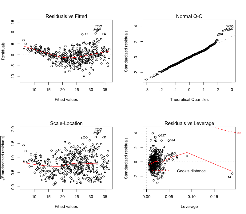
1. Residual plot
First plot that’s generated by plot() in R is the residual plot, which draws a scatterplot of fitted values against residuals, with a “locally weighted scatterplot smoothing (lowess)” regression line showing any apparent trend.
This one can be easily plotted using seaborn residplot with fitted values as x parameter, and the dependent variable as y. lowess=True makes sure the lowess regression line is drawn. Additional parameters are passed to underlying matplotlib scatter and line functions using scatter_kws and line_kws, also titles and labels are set using matplotlib methods. The ; in the end gets rid of the output text <matplotlib.text.Text at 0x000000000> at the top of the plot 1. Top 3 absolute residuals are also annotated:
plot_lm_1 = plt.figure(1)
plot_lm_1.set_figheight(8)
plot_lm_1.set_figwidth(12)

plot_lm_1.axes[0] = sns.residplot(model_fitted_y, 'mpg', data=auto,
                                  lowess=True,
                                  scatter_kws={'alpha': 0.5},
                                  line_kws={'color': 'red', 'lw': 1, 'alpha': 0.8})

plot_lm_1.axes[0].set_title('Residuals vs Fitted')
plot_lm_1.axes[0].set_xlabel('Fitted values')
plot_lm_1.axes[0].set_ylabel('Residuals')


# annotations
abs_resid = model_abs_resid.sort_values(ascending=False)
abs_resid_top_3 = abs_resid[:3]

for i in abs_resid_top_3.index:
    plot_lm_1.axes[0].annotate(i,
                               xy=(model_fitted_y[i],
                                   model_residuals[i]));
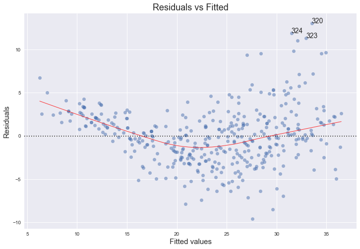
2. QQ plot
This one shows how well the distribution of residuals fit the normal distribution. This plots the standardized (z-score) residuals against the theoretical normal quantiles. Anything quite off the diagonal lines may be a concern for further investigation.
For this, I’m using ProbPlot and its qqplot method from statsmodels graphics API. statsmodels actually has a qqplot method that we can use directly, but it’s not very customizable, hence this two-step approach. Annotations were a bit tricky, as theoretical quantiles from ProbPlot are already sorted:
QQ = ProbPlot(model_norm_residuals)
plot_lm_2 = QQ.qqplot(line='45', alpha=0.5, color='#4C72B0', lw=1)

plot_lm_2.set_figheight(8)
plot_lm_2.set_figwidth(12)

plot_lm_2.axes[0].set_title('Normal Q-Q')
plot_lm_2.axes[0].set_xlabel('Theoretical Quantiles')
plot_lm_2.axes[0].set_ylabel('Standardized Residuals');

# annotations
abs_norm_resid = np.flip(np.argsort(np.abs(model_norm_residuals)), 0)
abs_norm_resid_top_3 = abs_norm_resid[:3]

for r, i in enumerate(abs_norm_resid_top_3):
    plot_lm_2.axes[0].annotate(i,
                               xy=(np.flip(QQ.theoretical_quantiles, 0)[r],
                                   model_norm_residuals[i]));
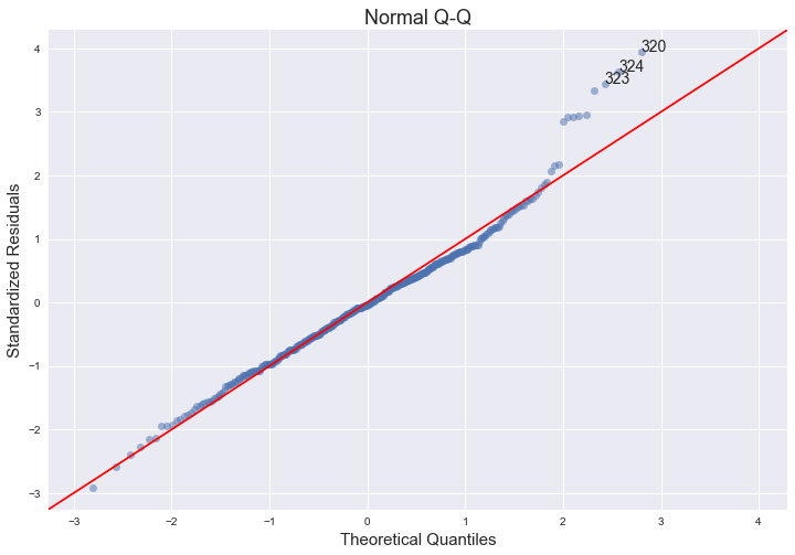
3. Scale-Location Plot
This is another residual plot, showing their spread, which you can use to assess heteroscedasticity.
It’s essentially a scatter plot of absolute square-rooted normalized residuals and fitted values, with a lowess regression line. Scatterplot is a standard matplotlib function, lowess line comes from seaborn regplot. Top 3 absolute square-rooted normalized residuals are also annotated:
plot_lm_3 = plt.figure(3)
plot_lm_3.set_figheight(8)
plot_lm_3.set_figwidth(12)

plt.scatter(model_fitted_y, model_norm_residuals_abs_sqrt, alpha=0.5)
sns.regplot(model_fitted_y, model_norm_residuals_abs_sqrt,
            scatter=False,
            ci=False,
            lowess=True,
            line_kws={'color': 'red', 'lw': 1, 'alpha': 0.8})

plot_lm_3.axes[0].set_title('Scale-Location')
plot_lm_3.axes[0].set_xlabel('Fitted values')
plot_lm_3.axes[0].set_ylabel('$\sqrt{|Standardized Residuals|}$');

# annotations
abs_sq_norm_resid = np.flip(np.argsort(model_norm_residuals_abs_sqrt), 0)
abs_sq_norm_resid_top_3 = abs_sq_norm_resid[:3]

for i in abs_norm_resid_top_3:
    plot_lm_3.axes[0].annotate(i,
                               xy=(model_fitted_y[i],
                                   model_norm_residuals_abs_sqrt[i]));
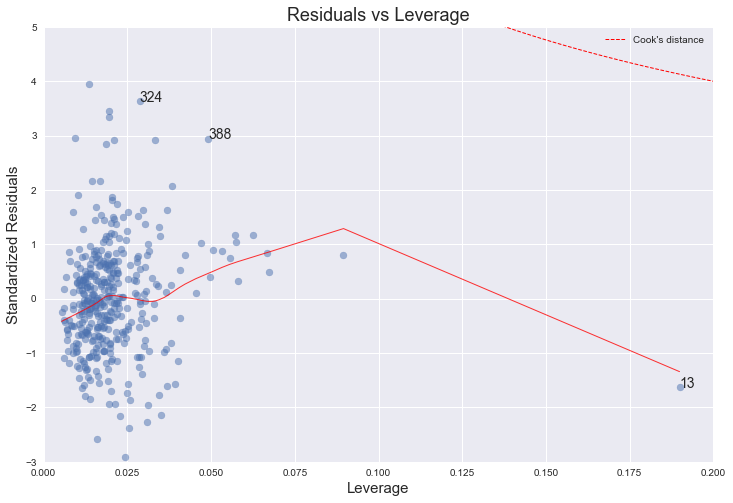
4. Leverage plot
This plot shows if any outliers have influence over the regression fit. Anything outside the group and outside “Cook’s Distance” lines, may have an influential effect on model fit.
statsmodels has a built-in leverage plot for linear regression, but again, it’s not very customizable. Digging around the source of the statsmodels.graphics package, it’s pretty straightforward to implement it from scratch and customize with standard matplotlib functions. There are three parts to this plot: First is the scatterplot of leverage values (got from statsmodels fitted model using get_influence().hat_matrix_diag) vs. standardized residuals. Second one is the lowess regression line for that. And the third and the most tricky part is the Cook’s distance lines, which I currently couldn’t figure out how to draw in Python. But statsmodels has Cook’s distance already calculated, so we can use that to annotate top 3 influencers on the plot:
Update: I think I figured out how to draw Cook’s distance ($D_i$) contours for $D_i=0.5$ and $D_i=1$ The trick was rearranging the formula $p{D_i} = r_i^2 h_i/(1-h_i)$ to plot the lines at 0.5 and 1.
plot_lm_4 = plt.figure(4)
plot_lm_4.set_figheight(8)
plot_lm_4.set_figwidth(12)

plt.scatter(model_leverage, model_norm_residuals, alpha=0.5)
sns.regplot(model_leverage, model_norm_residuals,
            scatter=False,
            ci=False,
            lowess=True,
            line_kws={'color': 'red', 'lw': 1, 'alpha': 0.8})

plot_lm_4.axes[0].set_xlim(0, 0.20)
plot_lm_4.axes[0].set_ylim(-3, 5)
plot_lm_4.axes[0].set_title('Residuals vs Leverage')
plot_lm_4.axes[0].set_xlabel('Leverage')
plot_lm_4.axes[0].set_ylabel('Standardized Residuals')

# annotations
leverage_top_3 = np.flip(np.argsort(model_cooks), 0)[:3]

for i in leverage_top_3:
    plot_lm_4.axes[0].annotate(i,
                               xy=(model_leverage[i],
                                   model_norm_residuals[i]))

# shenanigans for cook's distance contours
def graph(formula, x_range, label=None):
    x = x_range
    y = formula(x)
    plt.plot(x, y, label=label, lw=1, ls='--', color='red')

p = len(model_fit.params) # number of model parameters

graph(lambda x: np.sqrt((0.5 * p * (1 - x)) / x),
      np.linspace(0.001, 0.200, 50),
      'Cook\'s distance') # 0.5 line

graph(lambda x: np.sqrt((1 * p * (1 - x)) / x),
      np.linspace(0.001, 0.200, 50)) # 1 line

plt.legend(loc='upper right');
I learned a lot, and continuing to learn during this code porting. It’ll hopefully be helpful for others struggling with similar issues.
Cheers.